Graphs, diagrams and tables in PowerPoint presentations

Graphs, diagrams or charts can hardly be called sexy and more often than not they make your audience cringe. One of the major pitfalls is to overcomplicate your graphs and overload them with information, whereas the main message of your graph should be visible at first glance.
Here are three essential tips to present your audience with clear and easy-to understand graphs.
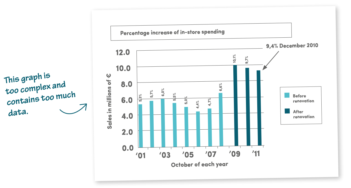
First of all, more often than not, the figures you need to present are from an Excel sheet, a Word table or yet another source, and we find it easy to just copy-paste that information. Bad idea! The result is never good. Most of the time Excel sheets contain all the details, making your slide too complex and confusing for the audience.
TIP 1: SIMPLIFY THE DATA
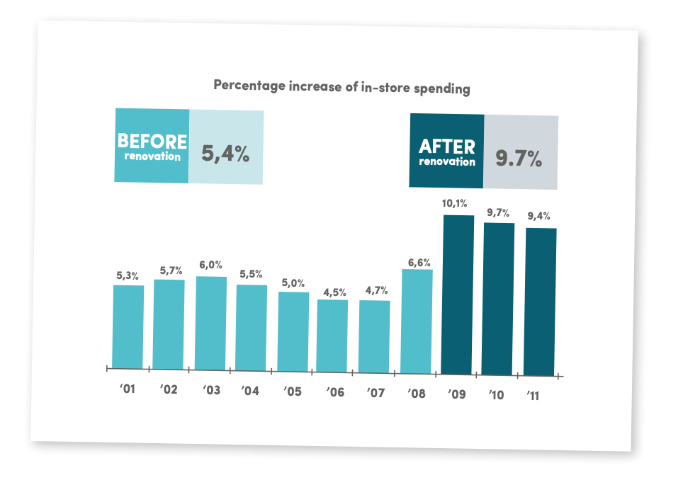
Think about what you want to show in your graph. An increase in turnover? Cutting costs? Spectacular profit? Cut out all elements from the graph that are not directly related to that topic and only use those figures that illustrate your point. Discard all details that take the attention away from your key message. Leave out backgrounds, unnecessary lines, figures, labels, shades and 3D-effects.
The essential information stands out in the graph below: a 9.7% increase after renovation.
By leaving out all irrelevant details, the graph becomes a lot clearer. As a result, you get your message across unambiguously.
TIP 2: USE THE RIGHT GRAPH
Make sure you use the form of graph best suited for your presentation. We roughly distinguish between three forms: pie charts, line charts and bar charts.
- Pie Charts: Pie charts are particularly handy when it comes to illustrating proportions or percentages
- Line Charts: A line chart is used to show progress or development over time like an evolution, increase or decrease.
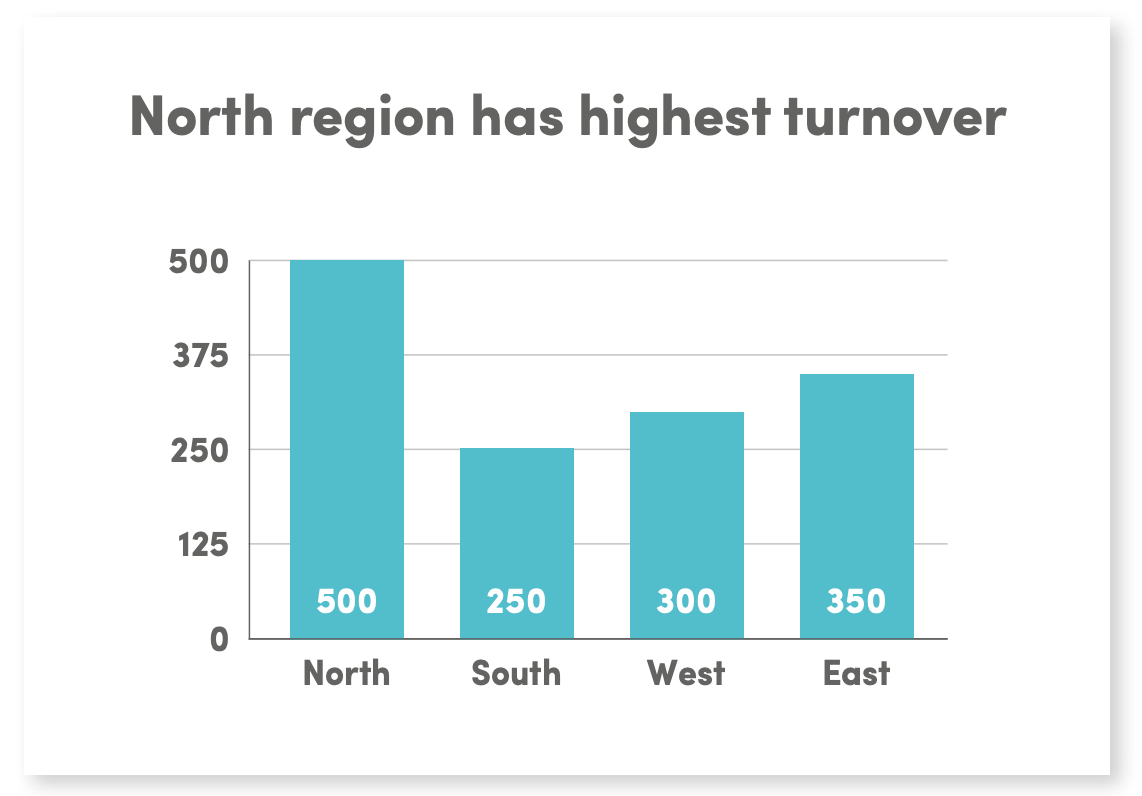
- Bar Charts: A bar chart is useful to visualise the value or quantity of an item compared to other factors. E.g. the turnover per product in different regions.
TIP 3: MAKE YOUR KEY MESSAGE STAND OUT
Graphs that don’t show the main message at first glance tend to confuse your audience. They have to look for the information and chances are they’ll going home with the wrong message. Many speakers just assume that the audience will analyse whatever is projected in a graph on the screen, and automatically draw the conclusion they want them to draw. Why not change a vague title such as “Turnover per region” into “North region has highest turnover”?
One last thing: colours in a diagram are very important. They can either attract attention or distract your audience. If you look at the pie chart below, you will see that the attention is immediately drawn to the orange segment, as this is a vibrant colour. However, the black segment is the larger part.
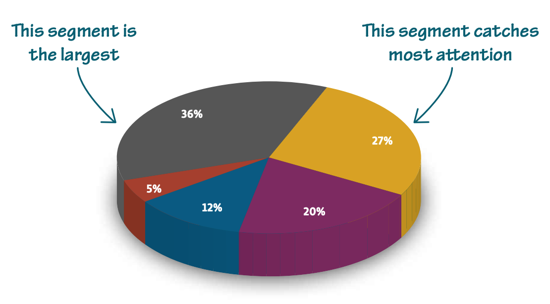
In other words, choose contrasting colours to draw the audience’s attention and find out which piece of the pie you want it to go to.


